Mobile BI Design Framework: Making the Case for Small

In mobile business intelligence (BI) design, the “case for small” stems from the need to effectively manage performance and response time for mobile experiences. The concept has nothing to do with smaller screens or device sizes. Instead, it deals with the delivery of the content onto those screens.

One of the common denominators of all mobile user experiences deals with what I call the “patience factor.” Mobile users tend to be less patient about performance and response time than PC users, since they’re on the go with less time to spare.

On the Nature of Reported Truth

I find it painful that despite all the amazing data available at our fingertips, it’s sometimes still so hard to get at the “truth.”

5 Signs of a Successful Mobile BI Initiative

When it comes to defining successfor most technology projects with user rollouts, such as mobile business intelligence (BI), adoption is the key indicator of success. The degree to which users embrace the solution depends on a variety of factors. Some may be highly visible and easily measurable. Others may be less so and may require interpretation. Moreover, additional measurements such as cost reduction or productivity improvements contribute to the overall success criteria.

My Big Data Inspiration Day Presentation

I recently presented at the Big Data Inspiration Day in the Netherlands, talking about real-life organizations that are using Big Data to get closer to customers, inspire employees, and optimize resources in real time. Here’s an edited-down version of my 15 minute presentation — and don’t forget to check out the other great presentations given…

Data is a Strategic Marketing Asset

In business, better-informed decisions often start with a strong appetite for data, followed by a healthy dose of skepticism for it. If available, our collective insight becomes the guiding light for our decisions enhanced by data. In the absence of it—when we are left to decide by ourselves—we seek wisdom in our own experiences to fill the void where we can’t find or rely on data.

Choosing Health Insurance #2 – the “Side Effects”

Data visualization and the side effects of choosing a health care plan…part 2.

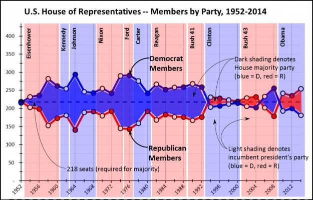
The U.S. House of Reps, and Data Visualization (#2)

The whole point of a graph is to give the reader a quick, easily comprehensible visual impression of the data, so even small changes can be critically important.

Choosing Health Insurance – More Data Visualization

We shift gears from recent posts to address a critical – and extremely timely – decision: choosing a health insurance plan, which you must do by 12/15 if you want a new plan in place by 1/1/15. If you’re a finance professional, you