
In the last installment of this series, I described the three key steps that everyday business intelligence (BI) users typically go through when they consume data: Observation, Perspective, and Insight. These steps often take place in an ad-hoc manner without the same degree of precision and requirements that one expects in corporate BI environments. Nevertheless, everyday BI users follow a similar process to achieve the same end goalâinsight through data for better-informed decisions.
Letâs take a look at a great example that demonstrates these three steps before I continue with our experiments in future installments. I have picked the Stocks app that comes preinstalled on the iPhone. This app provides a great tool to monitor stocks and financial markets for everyday users who donât need advanced tools.
Step One: Observation
In this first step, weâre primarily occupied with gathering basic data to answer rudimentary questions. In this case, we want to find out whatâs happening now or, if weâre accessing it after the close, what happened in the financial markets during the day.
Our initial observations focus on the change. And this is exactly what we see on the top panel where the market indices and stocks of our choice are listed.
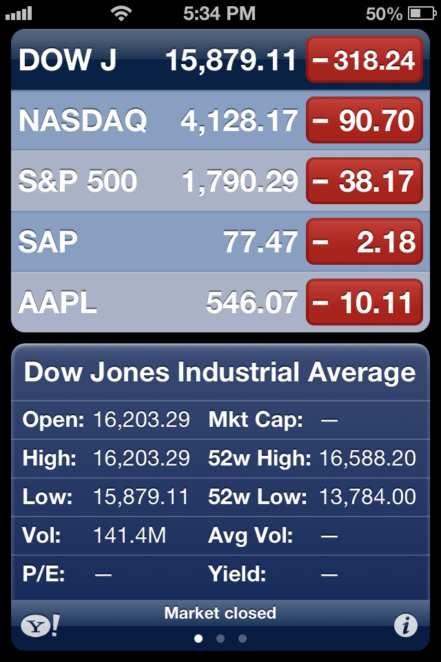
The colors on the buttons that indicate an up or down direction of the indices and the numbers provide us with an overall impression of what happened in the stock market. In this case, all reds point to a major drop and some of the results may appear to be significant. By simply pressing each button, we can see additional figures such as volume or percent change.
Step Two: Perspective
Once we determine through observation on the first screen (or home page) what happened, we next attempt to seek a perspective on the magnitude of change.
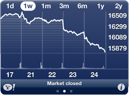
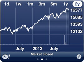
Was this a single day drop or has it been happening all week? How does this change compared to where it was last quarter, last year, or two years ago? Is this a small dip (or correction) or a sign of a more significant trend?
We may look at different charts to obtain a different perspective both on the short-term and the long-term view. Our background and/or knowledge in the analysis of these data visualizations may drive further questions.
Step Three: Insight
In this third step, we perform the final analysis to get insight because, while Steps One and Two revealed a significant drop in the stock market that included the stocks weâre following, we still donât know why this happened.
This is when we need to understand the root cause and/or identify any contributing factors. As we browse the news section of the app, we quickly see what might have contributed to the sellout.

Unlike the data in Steps One and Two, the data here comes in an unstructured format and requires further scrutiny. Headlines such as âStocks crushed: Emerging markets to blameâ? provide limited insight.
This stage is the most time consuming because it requires a deeper drill down. Here, for example, we need to examine several articles to fully understand why the market dropped. Thus, unlike looking at the numbers and/or historical charts, we move at a much slower speed to process detailed information compared to the summary information.
Bottom Line
In this example, we looked at a mobile app for stocks and how its design permitted the delivering of data effectively. In the first post of this series, I defined everyday BI as the framework that allows consumers (everyday people) to make faster, better-informed decisions about their lives.
This is important because if everyday BI is going to help us to do that, we need technology solutions that are designed for connecting the dots and deriving insight from data in these three simple and quick steps.
Stay tuned for the next installment of my Everyday BIÂ series.
If you like this blog, you may also enjoy the Mobile BI Design Framework series.
By Kaan Turnali, EPM Channel Contributor, from:Â http://www.the-decisionfactor.com/business-intelligence/everyday-bi-stocks/
As Global Senior Director, Business Intelligence (BI), for SAPâs Global Customer Operations (GCO) Reporting & Analytics Platform, Kaan Turnali is responsible for the development, oversight, and execution of strategy for the BI platform across GCOâs worldwide user base. In addition, he manages special mobile BI projects for the Office of co-CEO Bill McDermott and the GCO senior management team. Prior to joining SAP in 2006, he worked as a senior BI consultant specializing in strategy, design, and development of enterprise BI solutions for SMEs and Fortune 500 companies. His background and experience in the integration of business and technology span over two decades. He is also an adjunct professor, teaching BI in the doctor of business administration program at Wilmington University. See Kaanâs articles on EPM Channel here.

Leave a Reply